Design RenewalProject

Design RenewalProject

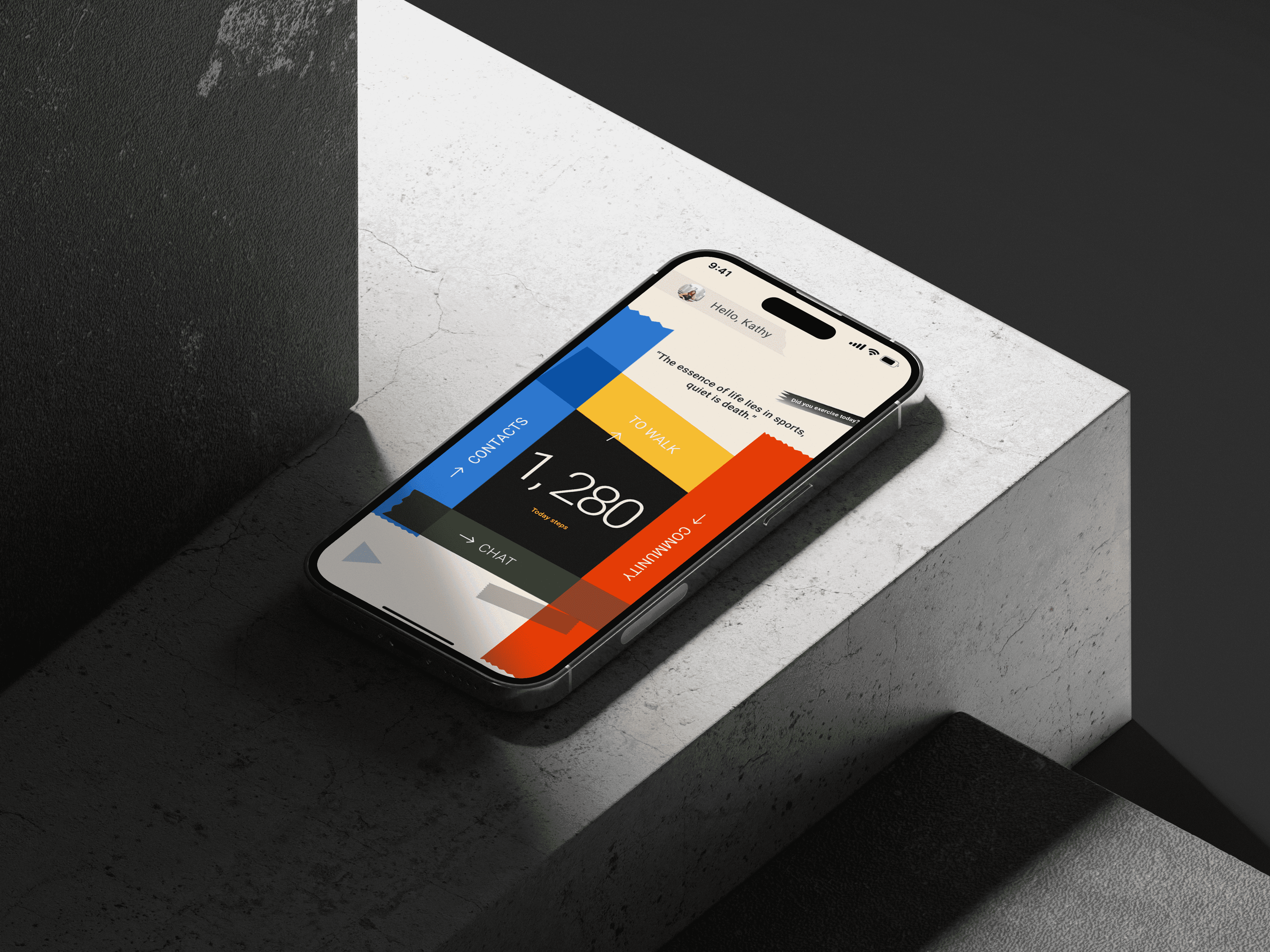
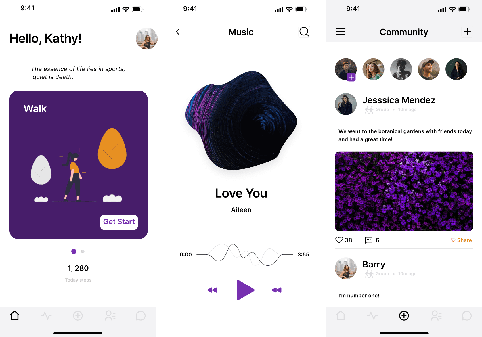
The core objective of this project was to redesign the interface of an app that promotes both physical activity and social interaction.


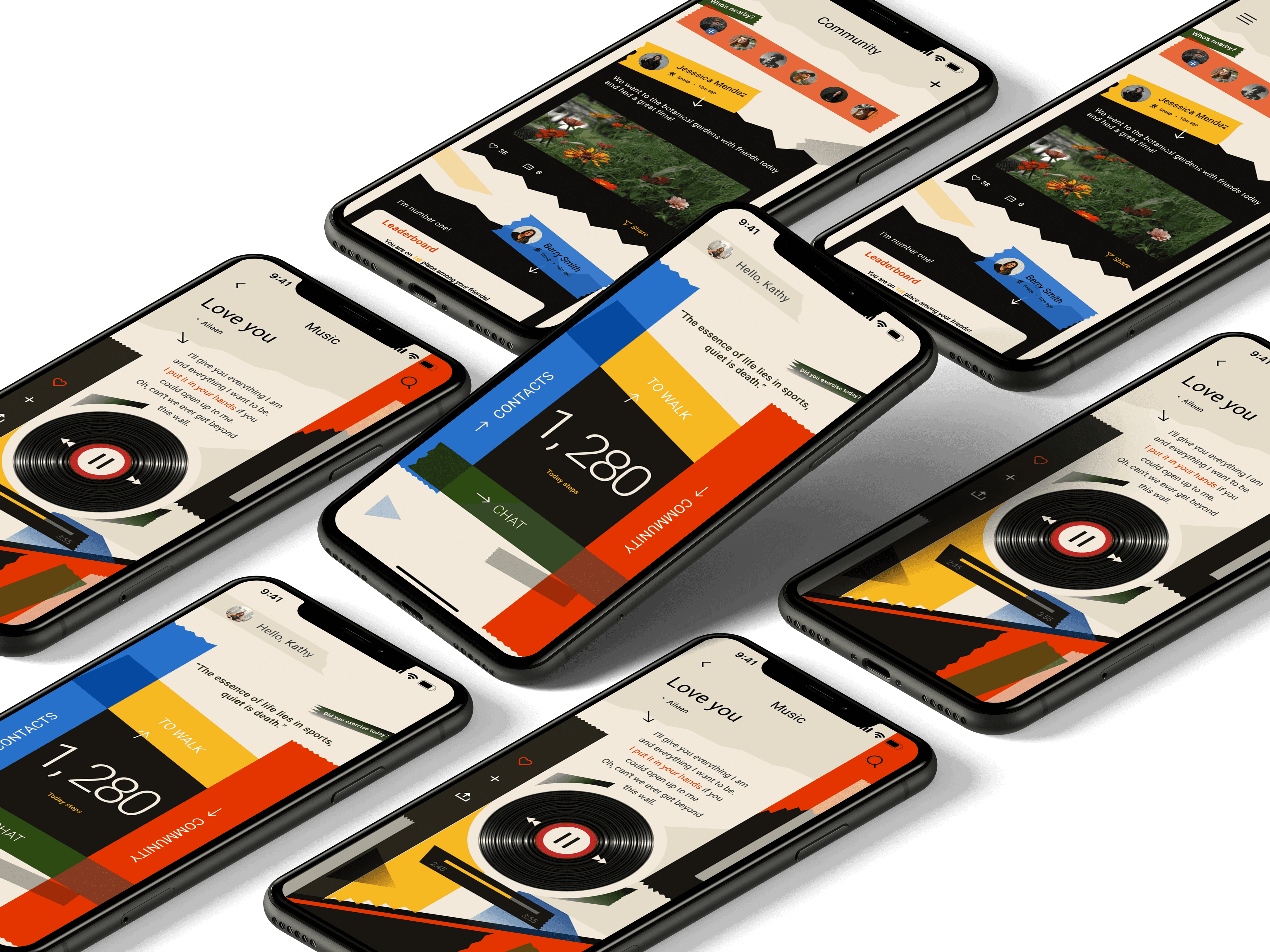
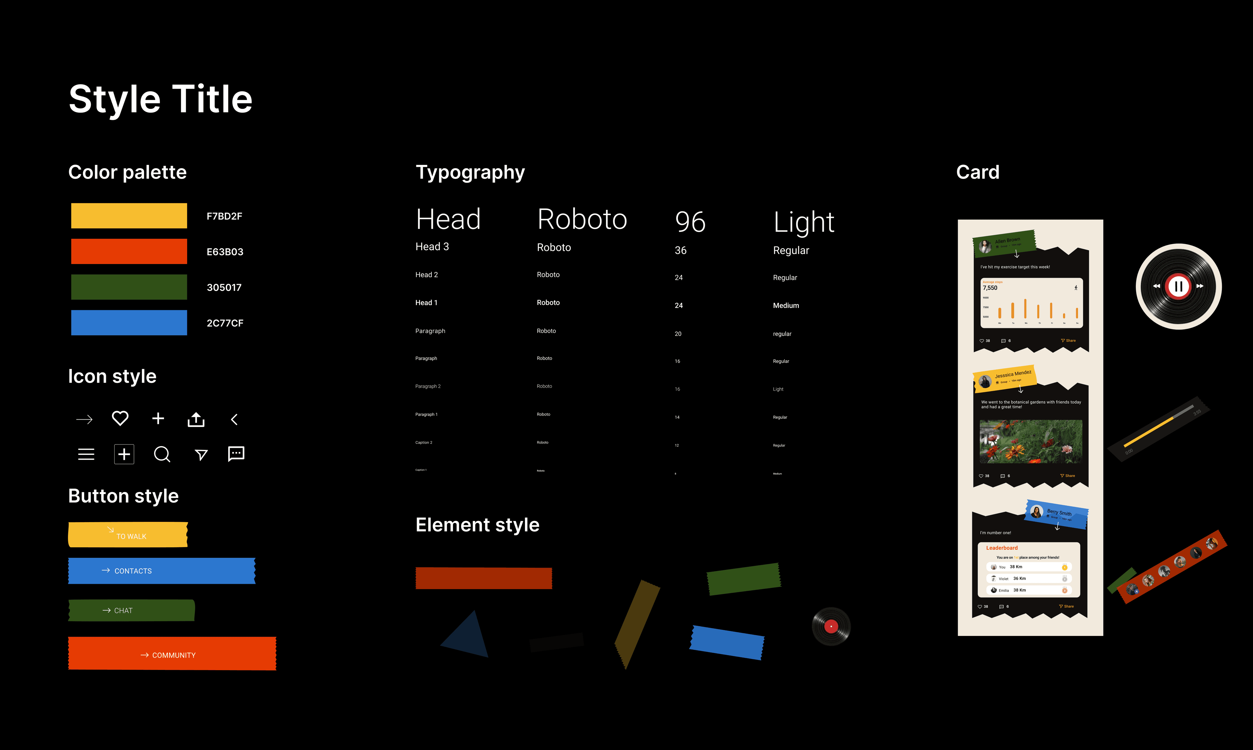
The previous design was overly simplistic and monotonous, lacking appeal to its users. In response, I introduced fresh design elements. The overarching design philosophy emphasizes using music and sports as mediums to enhance social connections and combat the loneliness inherent in modern life. The new interface aims to foster a sense of community and shared experiences, while also encouraging users to engage actively in sports and cultivate healthy lifestyle habits. The vibrant colour palette exudes an energetic ambience, and the tape elements symbolize that we should not be confined by fear, but rather be bold in exploring and experiencing new facets of life.

Tool

Tool

Figma Ps

Type

Type

UI design

Sector

Sector

Sports and Social

Client

Client

Personal work

Here comes the alt text

Let go of fear and laziness!
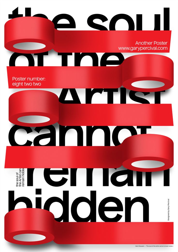
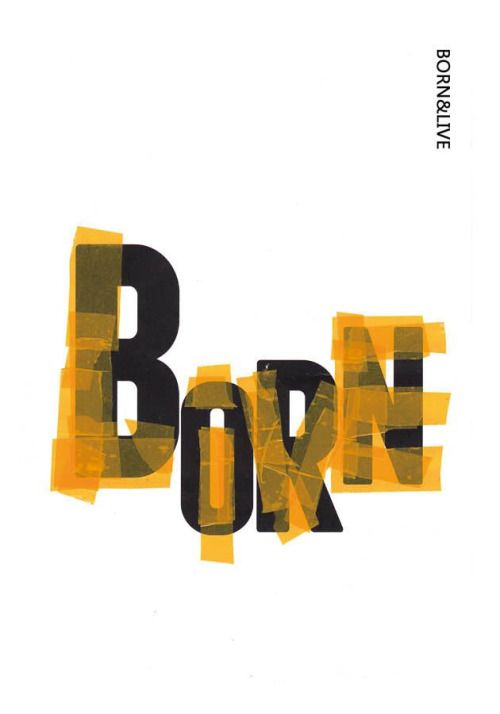
The tape symbolizes enduring commitment, creative adaptability, social connection, as well as the protection of personal privacy and breaking through limitations. This lends a deeper meaning to the interface.

The tape symbolizes enduring commitment, creative adaptability, social connection, as well as the protection of personal privacy and breaking through limitations. This lends a deeper meaning to the interface.

Here comes the alt text

Moodboard

"Bold color schemes, the clash between breakthrough and confinement. We shouldn't close ourselves off; let's enjoy life, embrace sports, and relish socializing."

The interface design is a celebration of life's dynamism. Be it the thrill of an athletic endeavor, the simple pleasures of daily life, or the joy of human connection, the design nudges one to be fully present. It's not just a visual treat, but a reminder – a call to action, urging users to unlock their potential, to let go of fear and complacency, and to dive headfirst into the myriad experiences that life has to offer.

The interface design is a celebration of life's dynamism. Be it the thrill of an athletic endeavor, the simple pleasures of daily life, or the joy of human connection, the design nudges one to be fully present. It's not just a visual treat, but a reminder – a call to action, urging users to unlock their potential, to let go of fear and complacency, and to dive headfirst into the myriad experiences that life has to offer.

Here comes the alt text

During the interface redesign process, I learned the importance of marrying form with function. While aesthetic appeal is paramount, the primary goal of any interface is usability and enhanced user experience. It's crucial to deeply understand the target audience, their needs, and emotions.

During the interface redesign process, I learned the importance of marrying form with function. While aesthetic appeal is paramount, the primary goal of any interface is usability and enhanced user experience. It's crucial to deeply understand the target audience, their needs, and emotions.

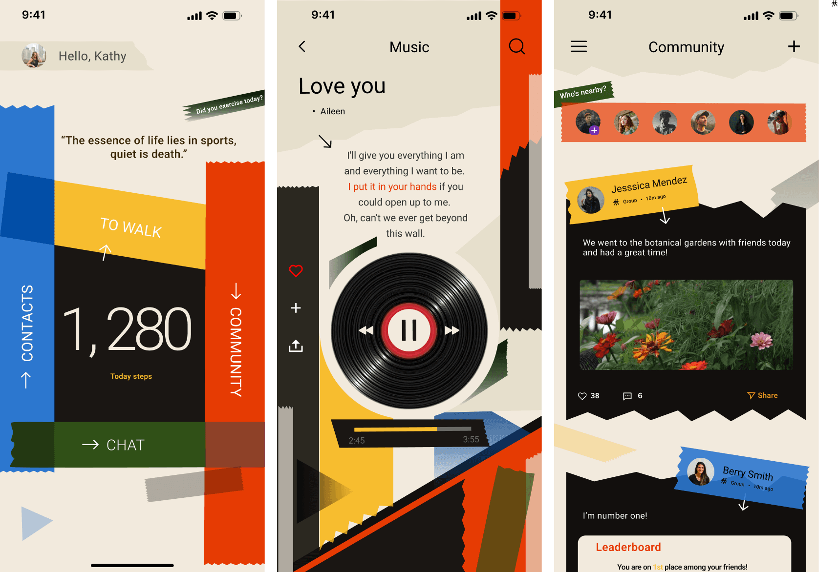
I also recognized the profound impact design can have in shaping behaviors, reinforcing values, and fostering community ties.

Through this project, I understood that design is not just about visual appeal but about creating meaningful narratives and impactful interactions.

Through this project, I understood that design is not just about visual appeal but about creating meaningful narratives and impactful interactions.

Credits

Credits

Art Direction

Art Direction

Indae

Indae

Photography

Photography

Kexin

Kexin